
Indeed, while the Android framework provides several default views, it is common for developers to find the need to create and customize views to suit their specific requirements. Oftentimes, the default views may not fully meet the design or functionality needs of a particular application, necessitating the development and redesign of custom views to better align with the app’s unique demands.
What is Compound view:
A Compound View in Android is a custom view that combines multiple existing views or components into a single, reusable, and self-contained unit. It allows developers to create more complex and specialized views by assembling several views together. By doing so, developers can encapsulate complex UI components and make their code more modular, promoting reusability and maintainability.
The Compound View pattern is useful when certain UI elements or groups of views need to be used together repeatedly across an application or when a set of views should behave as a single functional unit. It enables developers to create custom UI components tailored to their application’s specific needs, leading to a more organized and modular codebase.
Creating a Compound view:
In this tutorial, we will create a new version of the spinner view by combining various other views together to achieve a redesigned and customized user interface. Please have a look at the pictures below.
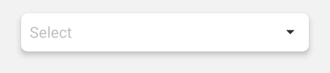
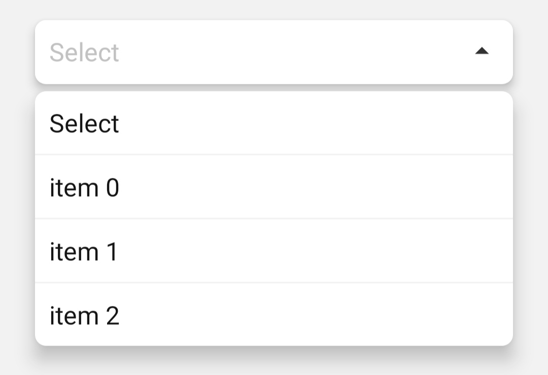
The spinner is formed by integrating two CardViews. The initial CardView houses a simple TextView and an upward-pointing arrow icon. Meanwhile, the second CardView contains a list of items. We will refer to this compound view as ISpinn.
Creating design:
To create the compound view, let’s create a file in the layout folder. Name it i_spinner.xml. Copy and paste the below code into that file.
<?xml version="1.0" encoding="utf-8"?>

<merge

    xmlns:android="http://schemas.android.com/apk/res/android"

    xmlns:app="http://schemas.android.com/apk/res-auto">

    <LinearLayout

        android:layout_width="match_parent"

        android:layout_height="wrap_content"

        android:layout_marginTop="@dimen/margin_5"

        android:layout_marginBottom="@dimen/margin_10"

        android:animateLayoutChanges="true"

        app:cardBackgroundColor="@color/colorGrayBackground"

        app:cardCornerRadius="@dimen/radius_5"

        app:cardElevation="0dp"

        android:clipToPadding="false"

        android:clipChildren="false">

        <LinearLayout

            android:layout_width="match_parent"

            android:layout_height="wrap_content"

            android:orientation="vertical">

            <androidx.cardview.widget.CardView

                android:id="@+id/cvSpinn"

                android:layout_width="match_parent"

                android:layout_height="wrap_content"

                android:layout_marginLeft="@dimen/margin_15"

                android:layout_marginRight="@dimen/margin_15"

                android:layout_marginTop="@dimen/margin_5"

                android:layout_marginBottom="@dimen/margin_5"

                app:cardCornerRadius="8dp"

                app:cardElevation="@dimen/shadow_5">

                <include android:visibility="invisible" layout="@layout/text_i_spinn_item" android:id="@+id/layoutTextSpinn"/>

                <LinearLayout

                    android:id="@+id/llSpinnerHolder"

                    android:orientation="vertical"

                    android:layout_width="match_parent"

                    android:layout_height="wrap_content"

                    android:background="@color/colorWhite"

                    android:padding="@dimen/padding_10">

                    <LinearLayout

                        android:orientation="horizontal"

                        android:layout_width="match_parent"

                        android:layout_height="wrap_content">

                        <TextView

                            style="@style/TextAppearance.AppCompat.Medium"

                            android:textColor="@color/black"

                            android:layout_weight="1"

                            android:id="@+id/tvValue"

                            android:layout_width="match_parent"

                            android:layout_height="wrap_content"/>

                        <ImageButton

                            android:id="@+id/ibDrop"

                            android:background="@null"

                            android:src="@drawable/ic_arrow_dropdown"

                            android:layout_width="wrap_content"

                            android:layout_height="wrap_content"/>

                    </LinearLayout>

                </LinearLayout>

            </androidx.cardview.widget.CardView>

            <androidx.cardview.widget.CardView

                android:visibility="gone"

                android:id="@+id/cvMenuHolder"

                app:cardCornerRadius="8dp"

                app:cardElevation="10dp"

                android:layout_marginLeft="@dimen/margin_15"

                android:layout_marginRight="@dimen/margin_15"

                android:layout_marginBottom="25dp"

                android:layout_width="match_parent"

                android:layout_height="wrap_content">

                <LinearLayout

                    android:id="@+id/llMenuHolder"

                    android:orientation="vertical"

                    android:layout_width="match_parent"

                    android:layout_height="wrap_content">

                </LinearLayout>

            </androidx.cardview.widget.CardView>

        </LinearLayout>

    </LinearLayout>

</merge>
Create another xml file in the layout folder, name it text_i_spinn_item.xml and paste the code below.
<?xml version="1.0" encoding="utf-8"?>

<layout>

    <LinearLayout

        xmlns:android="http://schemas.android.com/apk/res/android"

        android:orientation="vertical"

        android:layout_width="match_parent"

        android:layout_height="wrap_content">

        <TextView

            android:padding="10dp"

            android:id="@+id/tvItem"

            style="@style/TextAppearance.AppCompat.Medium"

            android:textColor="@color/black"

            android:layout_width="match_parent"

            android:layout_height="wrap_content"/>

        <View

            android:id="@+id/divider"

            android:background="@color/colorGrayBackground"

            android:layout_width="match_parent"

            android:layout_height="1dp"/>

    </LinearLayout>

</layout>
Add Declare Styleable
Add below code to your values/attrs.xml file
<declare-styleable name="ISpinn">

    <attr name="hint" value="Select" format="string"/>

    <attr name="hint_text_color" value="#e5e5e5" format="color"/>

</declare-styleable>
You can add more item names here. All these items will be inflated in your compound view.
Functionality:
Now it’s time to create the functionality. Create new class and name it ISpinn and paste the code below:
public class ISpinn extends LinearLayout {

    private int hintColor;

    private String hint;

    private TypedArray a;

    private ISpinnerBinding binding;

    private List<String> items;

    private OnIspinnItemSelected listener;

    private Animation rotateAnimationRight;

    private Animation rotateAnimationLeft;

    public ISpinn(Context context) {

        super(context);

        initializeViews(context);

    }

    public ISpinn(Context context, @Nullable AttributeSet attrs) {

        super(context, attrs);

        a = context.obtainStyledAttributes(attrs, R.styleable.ISpinn);

        try {

            hint = a.getString(R.styleable.ISpinn_hint) == null || a.getString(R.styleable.ISpinn_hint).equals("") ? "Select" : a.getString(R.styleable.ISpinn_hint);

            hintColor = a.getColor(R.styleable.ISpinn_hint_text_color, Color.parseColor("#979797"));

        }catch (Exception e){

        } finally {

            a.recycle();

        }

        initializeViews(context);

    }

    private void initializeViews(Context context) {

        rotateAnimationRight = AnimationUtils.loadAnimation(context, R.anim.rotate_180_right);

        rotateAnimationLeft = AnimationUtils.loadAnimation(context, R.anim.rotate_180_left);

        binding = ISpinnerBinding.inflate(LayoutInflater.from(context), this);

        binding.tvValue.setText(hint);

        binding.tvValue.setTextColor(hintColor);

        binding.llSpinnerHolder.setOnClickListener(new OnClickListener() {

            @Override

            public void onClick(View view) {

                showHideMenu();

            }

        });

        binding.ibDrop.setOnClickListener(new OnClickListener() {

            @Override

            public void onClick(View view) {

                showHideMenu();

            }

        });

    }

    private void showHideMenu() {

        if(binding.cvMenuHolder.getVisibility() == View.VISIBLE){

            binding.cvMenuHolder.setVisibility(GONE);

            binding.ibDrop.startAnimation(rotateAnimationLeft);

        }else {

            binding.cvMenuHolder.setVisibility(VISIBLE);

            binding.ibDrop.startAnimation(rotateAnimationRight);

        }

    }

    private void setText(String value, TextISpinnItemBinding tv){

        binding.tvValue.setText(value);

        binding.tvValue.setTextColor(Color.BLACK);

        if(listener != null && tv != null && items != null){

            listener.onItemSelected((Integer) tv.getRoot().getTag(), tv.tvItem.getText().toString());

        }else if(listener != null && tv == null && items != null){

            for (int i = 0; i < items.size(); i++) {

                if(items.get(i).equals(value)){

                    listener.onItemSelected(i, items.get(i));

                    break;

                }

            }

        }

    }

    public void setValue(String value){

        setText(value, null);

    }

    public void setItems(List<String> items){

        this.items = items;

        binding.llMenuHolder.removeAllViews();

        for (int i = 0; i < items.size(); i++) {

            TextISpinnItemBinding tv = TextISpinnItemBinding.inflate(LayoutInflater.from(getContext()));

            tv.getRoot().setTag(i);

            tv.tvItem.setText(items.get(i));

            tv.getRoot().setOnClickListener(new OnClickListener() {

                @Override

                public void onClick(View view) {

                    setText(tv.tvItem.getText().toString(), tv);

                    showHideMenu();

                }

            });

            if(i == items.size() - 1){

                tv.divider.setVisibility(GONE);

            }

            binding.llMenuHolder.addView(tv.getRoot());

        }

    }

    public void setOnItemSelectedListener(OnIspinnItemSelected listener){

        this.listener = listener;

    }

}
For the listener event we will create an interface and name it OnIspinnItemSelected.
public interface OnIspinnItemSelected {

    void onItemSelected(int position, String item);

}
Use the view:
Now we can simply use our newly created compound view as below:
<your.package.name.ISpinn
            android:clipToPadding="false"
            android:clipChildren="false"
            android:id="@+id/iSpinn"
            app:hint="@string/select"
            app:hint_text_color="@color/gray"
            android:orientation="vertical"
            android:layout_width="match_parent"
            android:layout_height="wrap_content"/>
iSpinn.setItems(options); // String list
 iSpinn.setOnItemSelectedListener(new OnIspinnItemSelected() {
    @Override
    public void onItemSelected(int position, String item) {

    }
 });
Additional Files:
We have used rotate animation when the user clicks on this custom view. You can add these files into your res/anim folder.
rotate_180_left.xml:
<?xml version="1.0" encoding="UTF-8"?>
<set xmlns:android="http://schemas.android.com/apk/res/android"
    android:ordering="sequentially"
    android:fillAfter = "true">

    <rotate
        android:fromDegrees="180"
        android:interpolator="@android:anim/accelerate_interpolator"
        android:toDegrees="0"
        android:pivotX="50%"
        android:pivotY="50%"
        android:repeatCount="0"
        android:duration="500" />

</set>
rotate_180_right.xml:
<?xml version="1.0" encoding="UTF-8"?>
<set xmlns:android="http://schemas.android.com/apk/res/android"
    android:ordering="sequentially"
    android:fillAfter = "true">

    <rotate
        android:fromDegrees="0"
        android:interpolator="@android:anim/accelerate_interpolator"
        android:toDegrees="180"
        android:pivotX="50%"
        android:pivotY="50%"
        android:repeatCount="0"
        android:duration="500" />

</set>


